Agapé Coffee – Pop-Up Brand Identity
Role: Brand Designer (Solo)
Tools: Illustrator, Photoshop
Project Type: Visual Identity + Packaging + Event Concept
Duration: ~ 2 week
Overview
Agapé Coffee is a conceptual identity for a traveling pop-up coffee brand rooted in Greek culture and hospitality. The brand blends playful modern typography with hand-drawn illustrations of classical ruins to create a warm, nostalgic, and casual visual system. The project explores how heritage and friendliness can coexist in a contemporary brand space.

Goal
Design a full visual identity for a coffee brand launching its first pop-up experience. The identity should:
Evoke Greek roots and timelessness
Feel casual, friendly, and social
Be adaptable across cups, menus, and digital content
Logo System
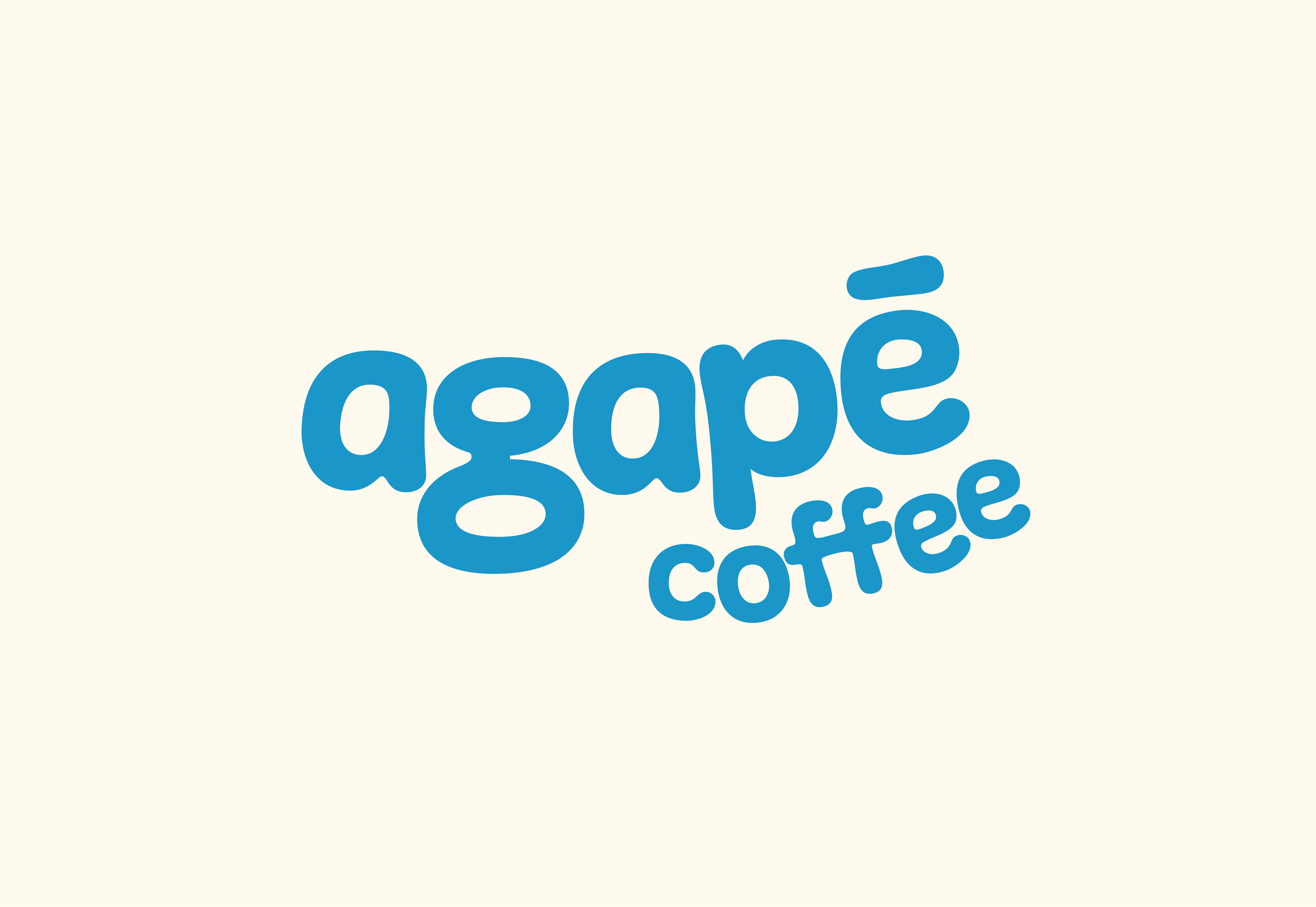
Primary Logo
The primary logotype uses rounded, bubbly typography in a soft blue, creating a warm and inviting first impression. The tilted “coffee” adds dynamic energy, while the macron over the 'e' becomes a distinctive visual marker, nodding to linguistic authenticity.

Secondary Mark
A hand drawn Greek ruin is used as an alternate logo element, adding a sense of age, texture, and character. This illustration enhances the brand’s cultural grounding without overwhelming the modern vibe.

Color & Type
Primary Blue: #0396c7 — vibrant, coastal, and fresh
Cream White: #fff7ea — soft, sun-faded backdrop
Typography: Custom-drawn logotype paired with clean, minimalist menu text

Deliverables
Pop-Up Menu Design
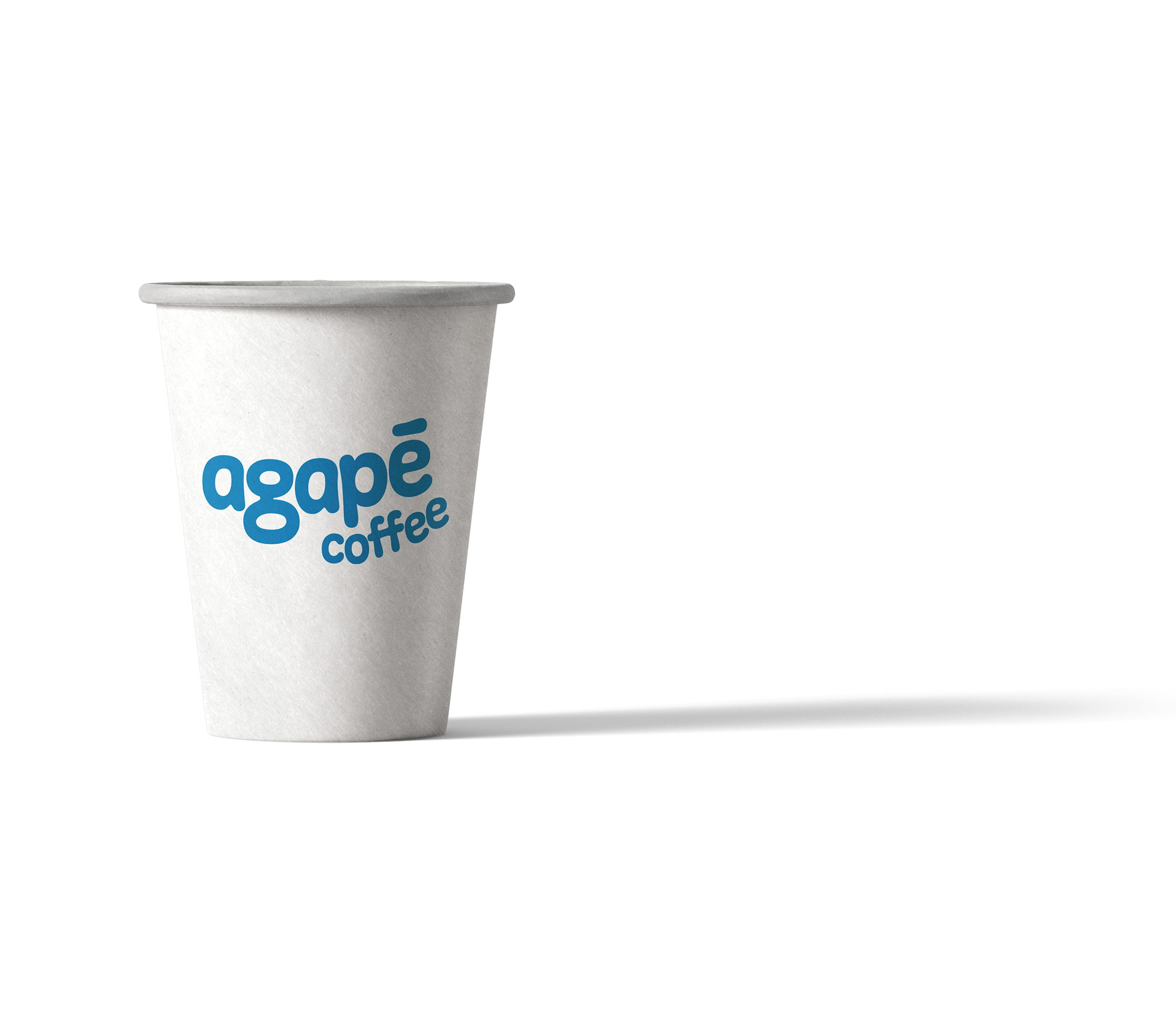
Clean layout featuring house blends and espresso optionsPackaging Mockups
To-go cups featuring the primary and secondary logosSocial/Digital Mockups
Brand visuals placed over Greek settings and coffee prep scenes


Reflection
Agapé Coffee gave me the chance to design with emotion and storytelling at the center. I wanted the brand to feel sun-warmed and hand-crafted—like sipping espresso on a quiet Greek street. Balancing clean typography with organic illustration allowed me to create a flexible yet character-driven identity.
If I took the project further, I’d develop signage and merchandise, introduce a more expansive color system, and build out templates for future pop-up campaigns.